
Improve UX in Job Application Flow KarirLink
A little of my writing while doing Research for the Job Application flow at KarirLink.
Motivated UI/UX Designer with 3 years in user-centric design at s.p Digital, passionate about art and technology, and active in the Indonesian design community.
Imagine you are looking for a job, The first thing you do is look for vacancies on the Job Portal, say on Linkedin, Glints, and whatever it is, the platform of a million people is often used to find job vacancies.
Then, when you get the vacancy, you must need detailed info, for example, if you are accepted for a job, what is the scope of your work, then roughly what is my salary range, with the same scenario but your status has just graduated, do you think the vacancy will accept fresh graduates or not? You must be in a dilemma, confused, dizzy (nope, kidding), it must be confusing, right?
So initiating from the above, it was decided to improve the work application flow so that you can get as clear information as possible (no confusion, dilemma, stress) and of course keep it updated with the application you have sent.
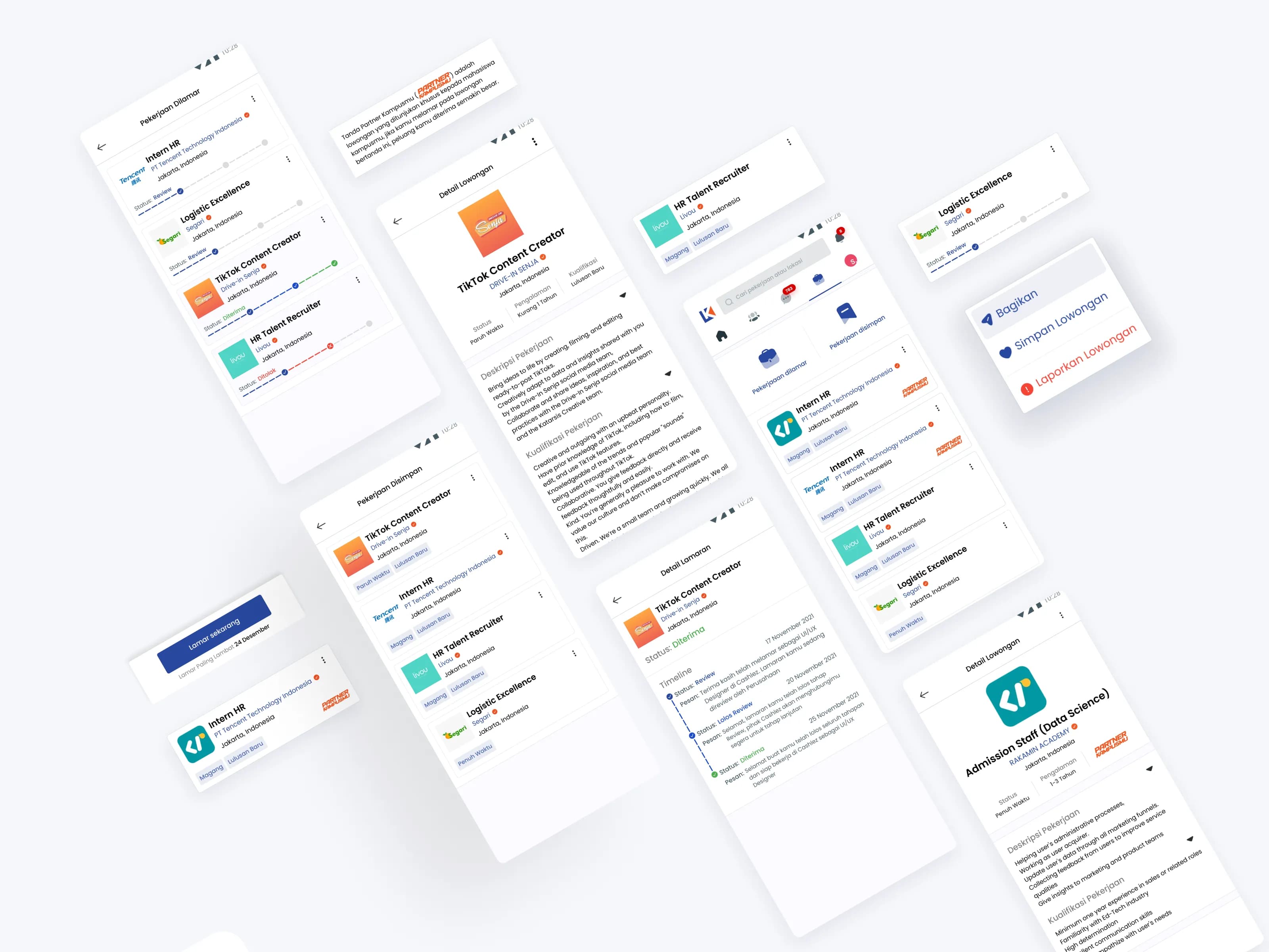
User Journey
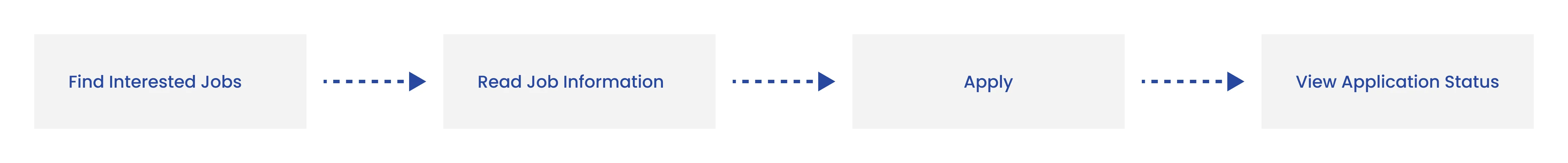
In general, when you want to apply for a job, more or less you will first find out what position you are interested in and according to your profile, then you read the details of the vacancy, if you feel it fits, you apply, and wait for a call from the company’s HR.
Because it was basically like that, in-depth interviews were conducted with several participants at that time, the goal was to know which steps needed to be improved.
Understandings
When conducting in-depth interviews, there were 2 interesting things about them, this was already mentioned at the beginning of this article, namely:
Applicants are confused with the details of the vacancies
They also find it difficult to know the status of the application
So, how to help them with this problem?
Visual Improvements
The method is to make improvements to the appearance of the Job Page on KarirLink, Here there are changes to the information contained in the vacancy card.
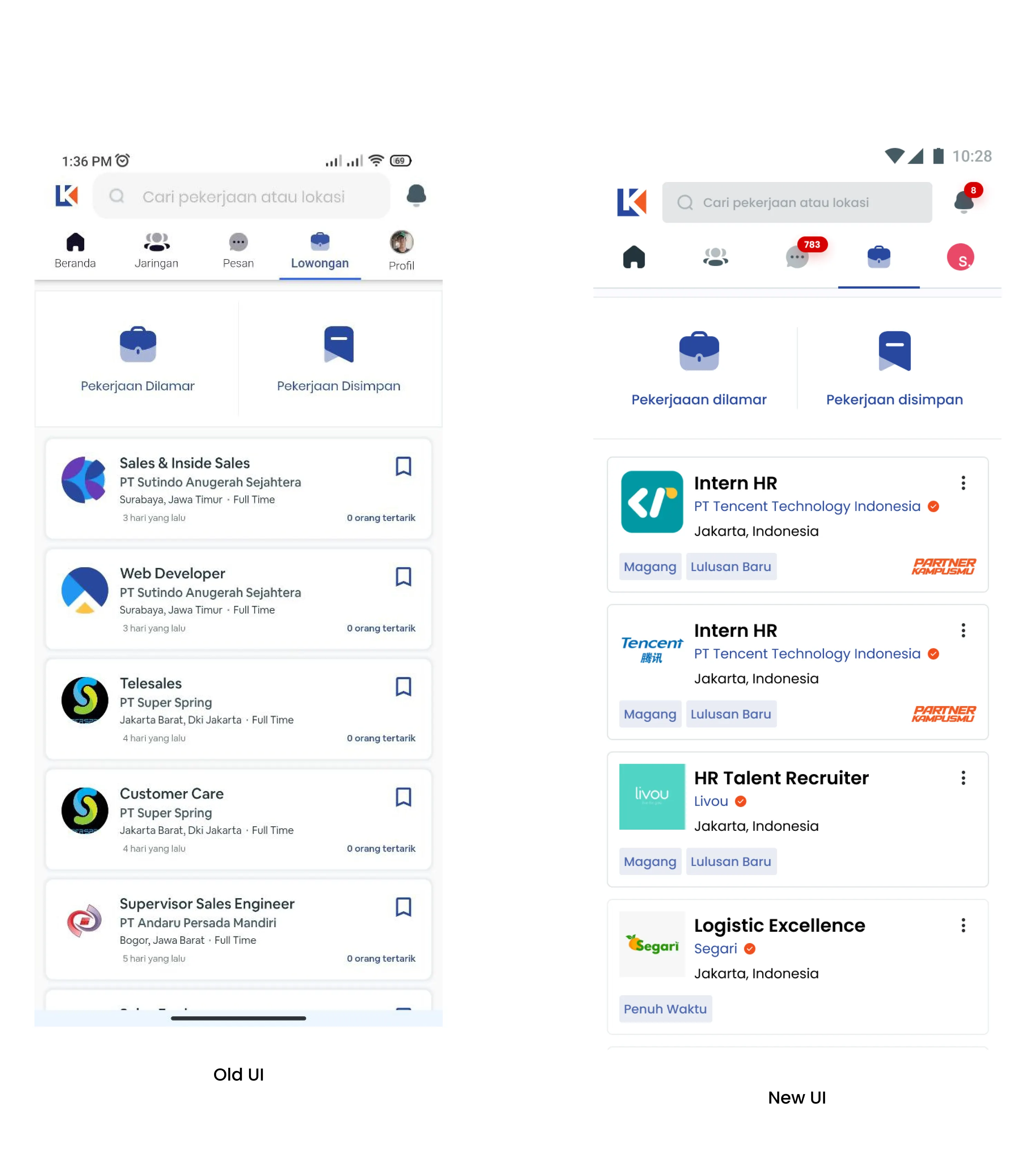
If you look at the card there are changes in the information, such as there is a label that informs the user if the vacancy is specifically for Interns, there is also a badge “Partner Kampusmu” which informs that the vacancy is only for graduates of the campus partner of the company concerned.
In addition to the Jobs Page, the detail view for vacancies is also updated.
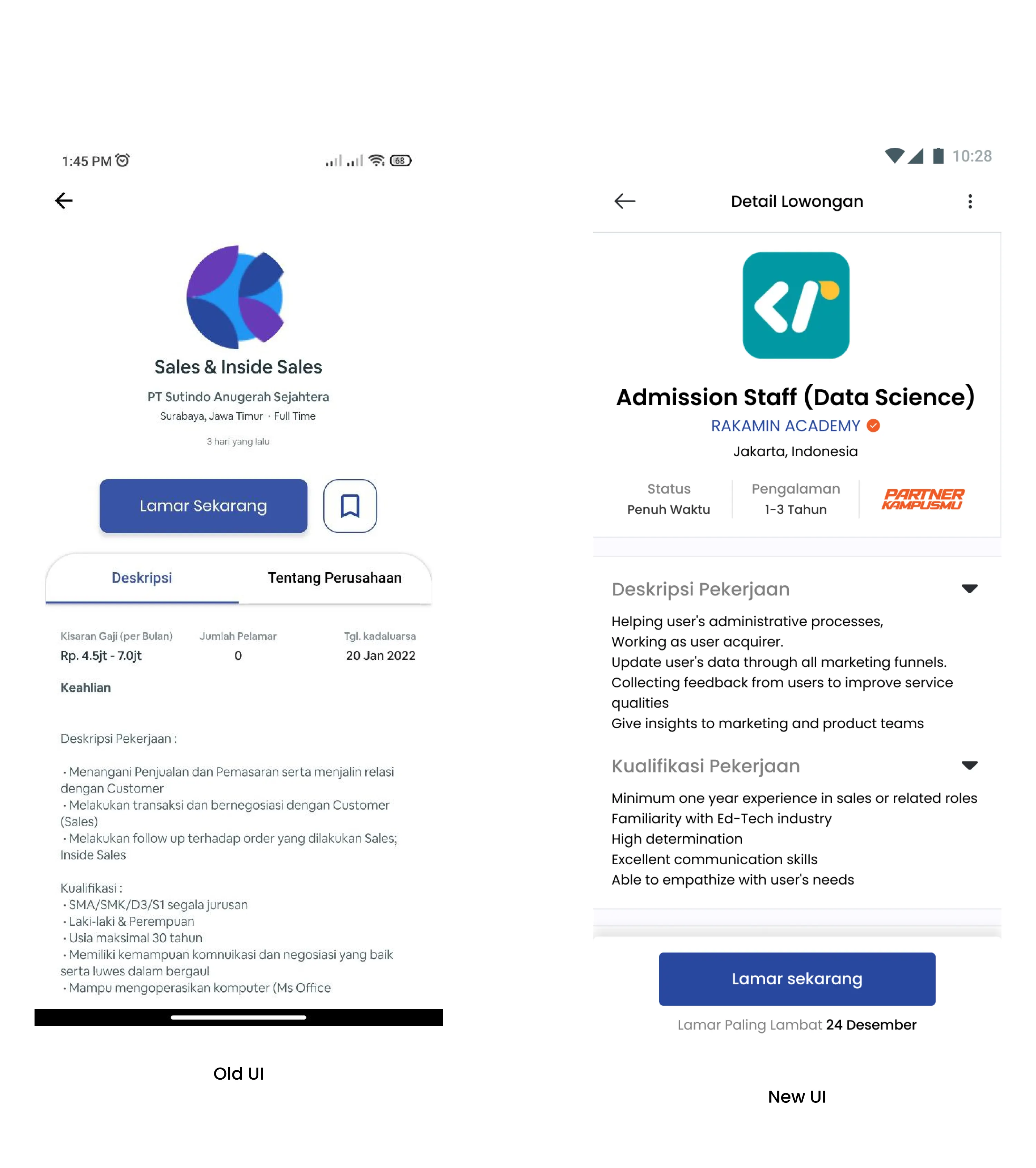
Significant changes seen are the information displayed is more “focused” and also on the “Lamar Sekarang” button located below.
There’s one more
Then, the next problem is how to keep applicants connected with the applications they bring to the company. After discussing with the team, it will be tested with automation.
The concept is the same as the scenario above but your application is ignored by HR, so your application will automatically be sent back to HR (within a certain time).
Then what if the vacancy is closed? If that happens then your application will automatically be rejected. (If this method is successfully realized, I will also make an article)
Thank You
Thank you for reading to the end, if you like it, you can 👏🏼 clap this article. If you have comments, you can be happy to write them in the comments section.
I also want to thank the entire KarirLink (GOTG) team who have guided me to do this project, there are Mas Yayan, Mas Wahyu, Mas Ichsan, Mas Valda, Mas Zharfan, Mbak Ferani.
And don’t miss the Antman Team, Mbak Dhea, thank you for helping with writing and research too, Mas Sam helped a lot during Research.